

Work

Skip: a home lender’s rebrand, rebuilt in Webflow.

Skip is an Australian home lender, formerly Sucasa, helping people buy a home with a smaller deposit. We built Sucasa’s website, and when the company rebranded as Skip in 2026, we rebuilt the site in Webflow from their designer’s new brand system.

Client
Skip Loans
Industry
Home lending
Country
Australia
Timeline
2025 to 2026
Work
Live site
skiploans.com.au(opens in a new tab)
Our team
  • Matthew BishopProject lead and build
  • Mark EspedidoWebflow development
Skip team
  • Adam TrouncerCo-Founder and COO
  • Katharina BasleyHead of Marketing
  • Clint NielsenDesigner, Incept
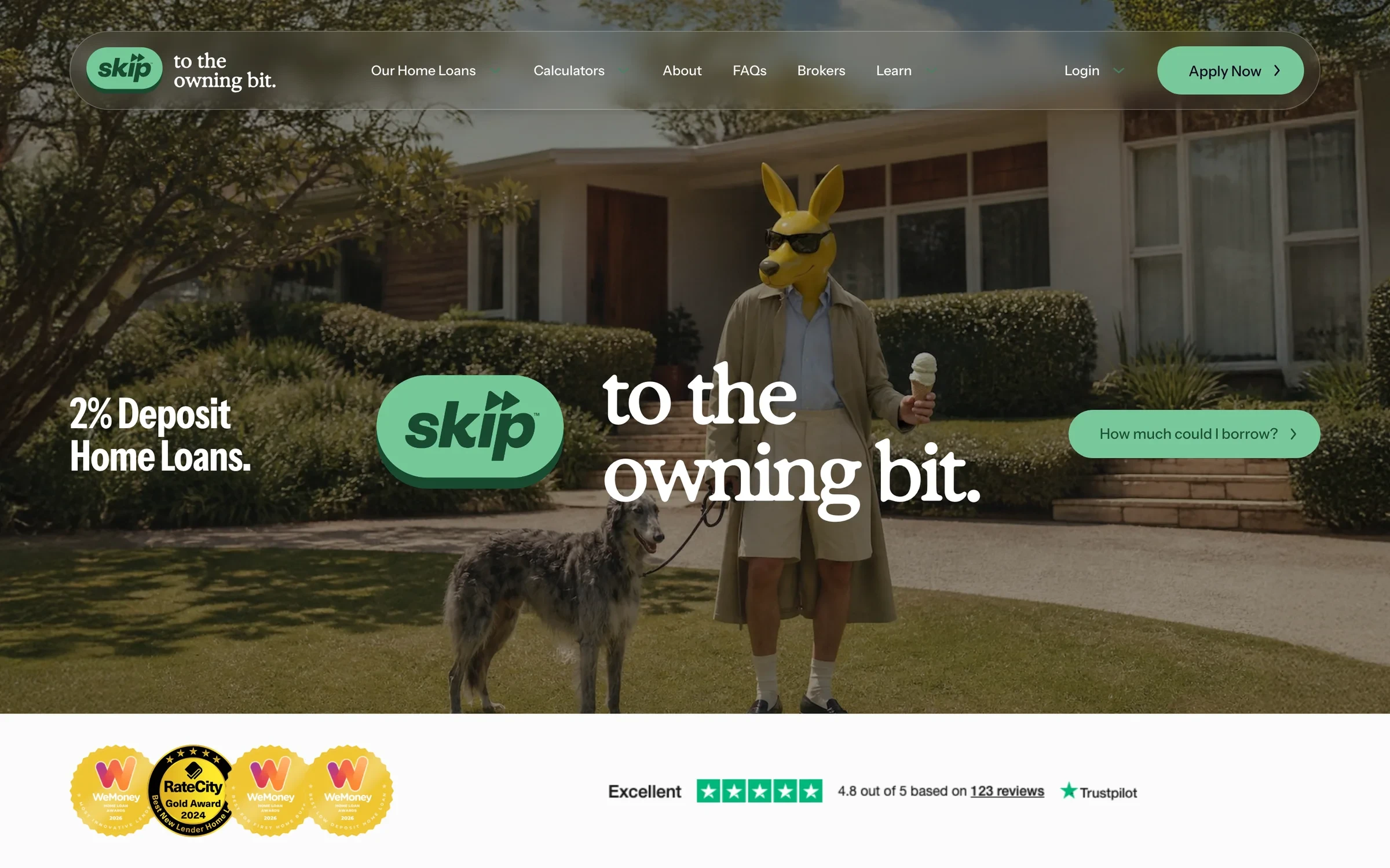
The Skip home page: “Skip to the owning bit.”

A new name, without losing the old one’s ground.

Sucasa had built up a website people trusted: calculators, a library of articles for home buyers, and search rankings earned over time. In 2026 the company rebranded as Skip, with a bold new identity, a kangaroo mascot and a much louder voice.

The new site had to look and feel entirely like Skip while keeping what worked: the same pages and journeys, every article, and the search traffic pointing at the old domain. And Skip’s own team needed to be able to edit it without breaking the design.

By the numbers.

  • 2websites built: Sucasa, then Skip
  • 78pages live, including articles and resources
  • 47articles and resources carried across
  • 3calculators on one shared, tabbed component
  • 10snap-scroll sections on the home page
  • 1domain change, with old addresses redirected page for page

What we did for Skip.

2025

The Sucasa website

We first built Sucasa’s Webflow website, with its home loan pages, calculators and a learning library for home buyers. It became the base the business grew on, and the site the rebrand would later replace.

  • Home loan pages for buying, investing and refinancing
  • Calculators for borrowing power, funds to complete and repayments
  • A learning library of articles for home buyers

February to April 2026

The rebuild as Skip

For the rebrand, Skip’s designer, Clint Nielsen of Incept, designed the new site in Figma, and we built it in Webflow as a new site alongside the old one, so the brand could launch on its own schedule. We started with the style guide, then built the home page and inner pages on it, and the site went live in April 2026.

  • A Webflow style guide built from the new brand system
  • A snap-scroll home page with parallax and animated brand tiles
  • A glass-effect mega menu
  • The three calculators rebuilt on a shared, tabbed component
  • Every article and resource carried across
  • The old domain redirected page for page
  • Components the team can edit without breaking the design
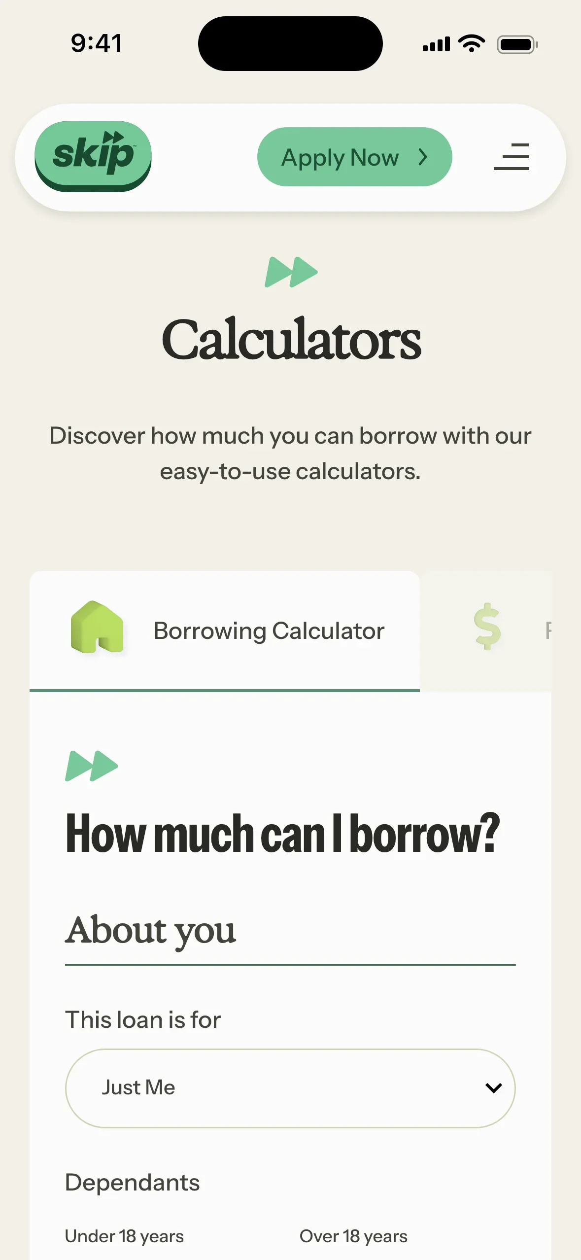
  • The Skip home page on a phone
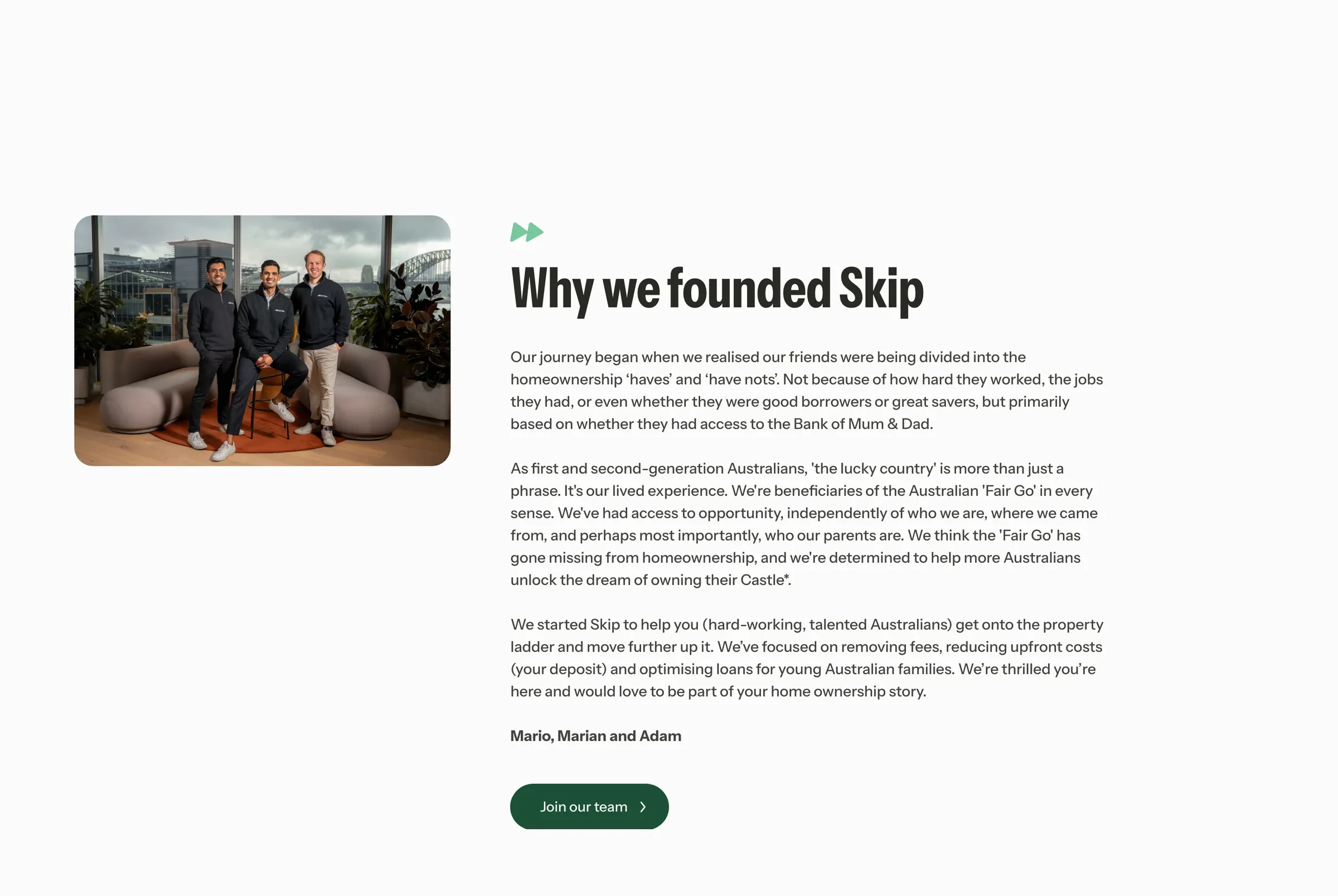
  • The Skip About page on a phone: “We founded Skip to help Aussies own a home”
  • The Skip calculators on a phone

A brand system, built once.

Skip’s new identity is loud and confident: deep greens, a kangaroo in sunglasses, and big, playful headlines. Before building a single page, we turned the designer’s brand system into a Webflow style guide, with the colours, type, buttons and spacing set up as variables and classes.

Every page was then built on that style guide, about 30 core pages in all, from buying a first home to refinancing and the legal pages a lender needs. A change to the brand happens in one place and flows through the whole site.

A home page that moves like an app.

Skip wanted the home page to feel like a modern finance app rather than a bank. It scrolls in snapping sections, each one settling into place, with parallax and the brand’s animated tiles bringing the “Why wait when you can Skip?” message to life.

Navigation sits in a glass-effect mega menu that keeps the page visible behind it, and collapses neatly on phones, where most home buyers do their first research.

Calculators people actually use.

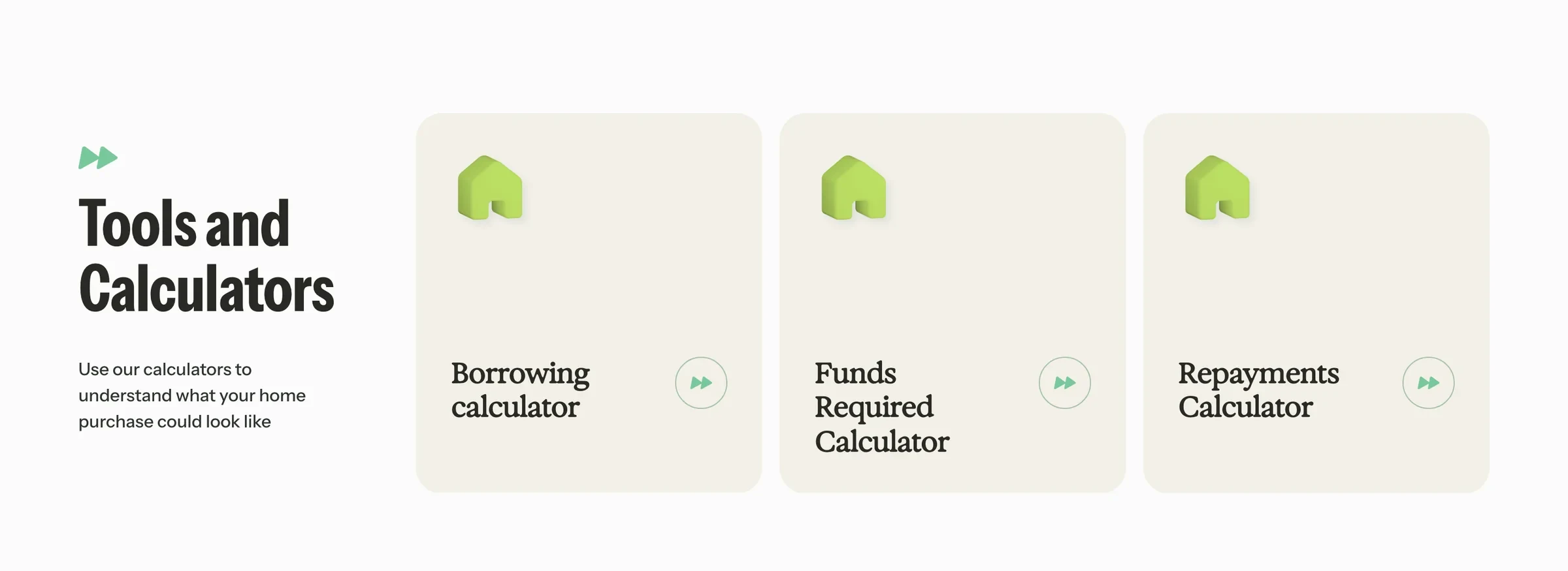
Home buyers come to a lender’s site to answer one question: how much can I borrow? Skip has three calculators, for borrowing power, funds to complete and repayments, and we rebuilt them on one shared component with tabs, so they look and behave the same.

Each calculator also has a page of its own, and smaller versions appear on the pages where they’re most useful, all built the same way so they stay consistent as the site grows.

A new name, the same search rankings.

A rebrand is a risky moment for search: a new domain can undo years of rankings. So the new site kept the old one’s structure, and every article and resource, 47 in all, came across into the new design with the same addresses.

The old Sucasa domain now redirects page for page to the same place on skiploans.com.au, so links, bookmarks and search results all land where they should.

A site Skip’s team runs.

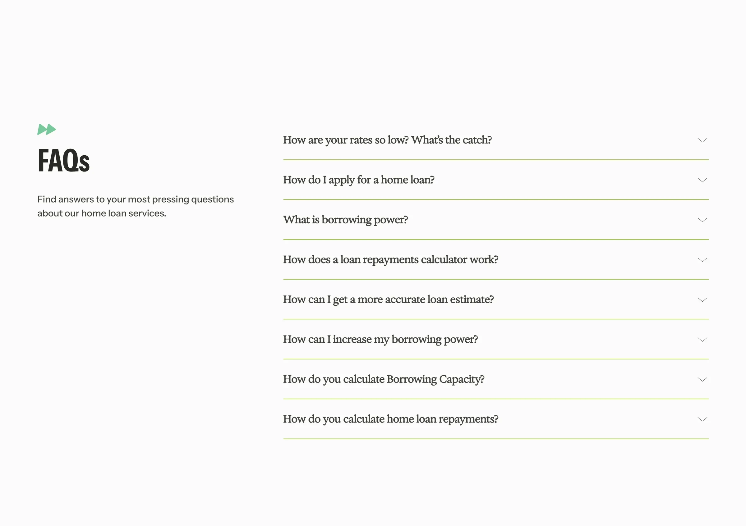
Skip publishes its own changes, so the site had to be hard to break. Sections are built as reusable components with only the content left open to edit, and the articles, resources and FAQs all run from Webflow’s CMS.

We worked in Skip’s own Slack throughout the build, with weekly check-ins, and handed it over ready for their team to keep updating, which they have.

In their words.

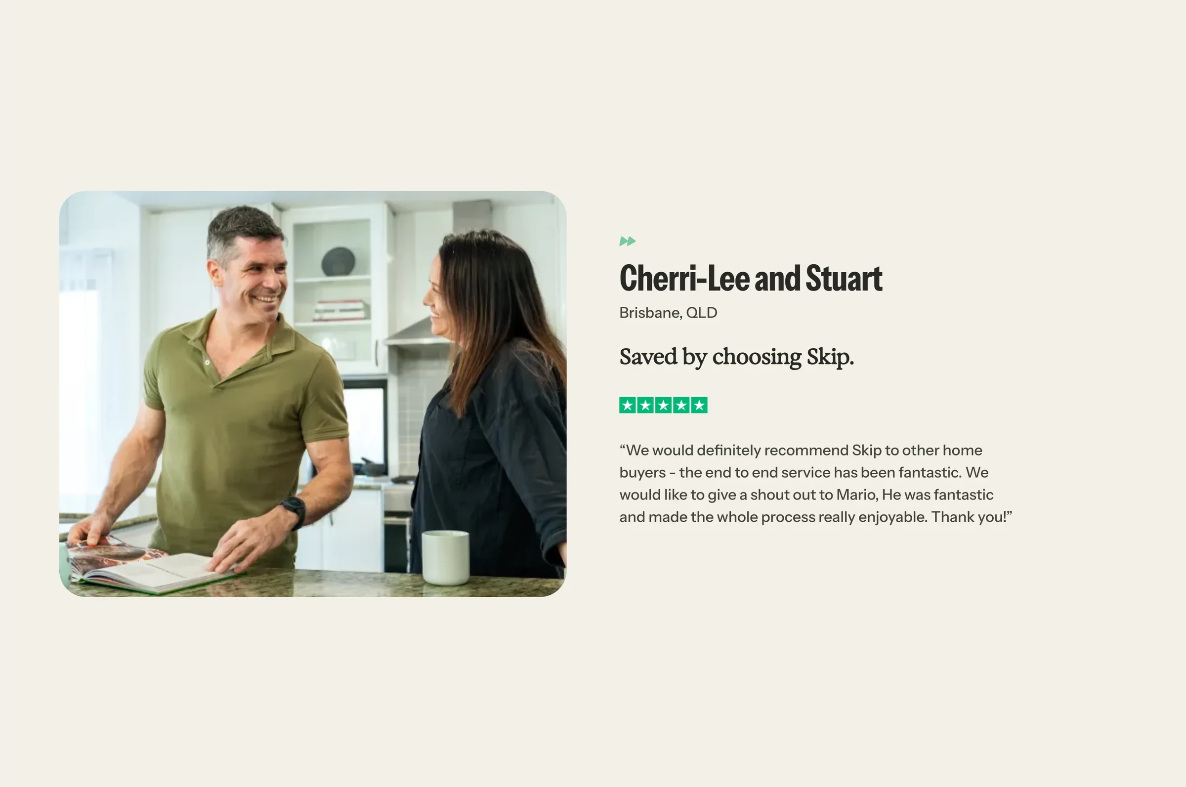
“Matt and the team at Superbrick have done an outstanding job on our new website. It’s rare to find an agency that not only delivers on time and within budget, but also approaches the project with the care and attention of a founder. They truly sweat the small stuff.”
Adam Trouncer, Co-Founder, SkipGoogle review ↗