
How we build client proposals in Paper
How we turn call notes into a proposal deck in Paper with Claude: a template on our site’s grid, a clear scope, review passes and a PDF.
- Written by
 Matthew Bishop
- Published
- Reading time
- 6 minutes
We build client proposals in Paper with Claude. Each one starts as a copy of a template deck built on our website’s design system. Claude drafts the slides from the call notes, we comment on what needs changing, and after a few review passes it exports a PDF and drafts the cover email.
Because the template sits in the same Paper file as the website’s design system, every proposal uses the site’s grid, type and colours without anyone setting them up. Here’s how it works, from the proposals we’ve built this way since August 2026.
1. Start from a template that matches the website
Our proposal template is a deck of slides at 1,280 by 800 pixels, built on the website’s own layout. When we asked Claude to “align the design more to website - approved designs”, it read the real values off the home page rather than eyeballing them:
- the same padding, side rail and content column as the site, so each slide looks like a page of the website cropped to one screen
- the same type scale and colour tokens
- the logo copied from the approved design, not redrawn
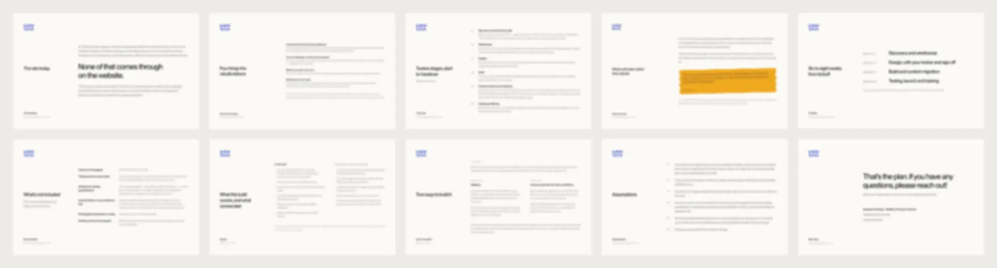
Slides from two different proposals, zoomed out. The grid, type and colours are the same because each deck starts as a copy of the last.
Every new proposal is a copy of the last one. Claude duplicates the slides, so the layout, type and colour rhythm stay identical and only the content changes. Because it all comes from the design system’s tokens, a change to the brand carries through to the proposals too.
2. Draft the slides from the call notes
We give Claude whatever the client has given us: the Granola notes and transcript from the first call, an email, or a site plan the client wrote. Before building anything, it proposes a slide map: one line per slide, with where each slide’s content comes from. That’s the moment to change the structure, before any design work happens.
Our proposals usually run in this order:
- Cover
- The situation: what the client told us, in their words
- What we’re building
- Scope: what’s in this build, and what comes later
- The work, stage by stage
- How we build it, where the client could go either way between Webflow and a custom build
- Timeline
- What’s not included
- Proof: what clients say about working with us
- Investment
- Keeping it running: ongoing support after launch
- Assumptions
- One clear next step
Using the client’s own language matters more than any design choice. The names they use for their products, pages and teams go straight into the slides.
3. Make the scope impossible to misread
The slide we care most about is scope. As Matt put it, he wanted to be “a bit more explicit about what the scope looks like” so nothing could be read as included when it wasn’t.
So the scope slide has two columns: in this build, and a later phase, quoted separately. The most useful distinction turned out to be between a template and its content. A resource hub can be in this build while the articles to fill it are a later phase. The same goes for search: technical SEO ships with the site, ongoing content doesn’t.
Then we check that every other slide agrees. If something moves out of scope, Claude finds every place that still mentions it: the stages, the page count, the not-included list and the assumptions.
4. Comment on the slides, not in a chat
Feedback goes on the slides as Paper comments, pinned to the thing that needs changing. A few of ours:
- “Can the cards be vertical?”
- “Can these be numbered instead of dot points to keep same style”
- “Make this a better sign off text than this”
Claude works through every open comment and marks each one resolved. When a comment could mean two things, it asks rather than guesses: “Remove tags” could have meant one label or every section heading across the deck, so it checked first. It also fixes the same problem where nobody left a comment. A note that one slide’s background was the wrong colour led to two more slides with the same problem being fixed too.
5. Run review passes before it goes out
Once the deck is complete, we ask for reviews, each looking for something different:
- A content audit. Claude reads every slide for leftovers from the template, page numbers out of order, and numbers that disagree between slides, like a page count that’s eight on one slide and nine on another.
- A fact check against the call. We ask whether the client actually said what a slide claims. On one proposal, a launch date had crept in as a hard deadline. The transcript showed it was a target, so the deck was softened to match.
- A persuasion review, using Claude’s marketing skills. On one deck it found the biggest gap was proof. We added a slide of real Google reviews and put it just before the price, so the investment reads after the reassurance.
- A finishing pass: balanced line breaks with
text-wrap: pretty, no single words left alone on a line, no em dashes, and everything in our own type.
6. Export a PDF and draft the email
Paper exports every slide into a single PDF. We open it before sending, because a PDF reads differently from the canvas. On our first proposal the text felt small once it was a PDF. Rather than shrinking anything, Claude widened the content column and scaled the type up by about 13%, so the slides kept roughly the same line breaks.
Finally, Claude drafts a short cover email from the call notes and the finished deck, and leaves it as a draft in Gmail. A person always reads it, attaches the PDF and sends it.
What we’ve learned
- Check the slide map before the slides. Changing the structure costs a minute at that point and an hour later.
- Keep every claim traceable to the notes, the transcript or something the client sent.
- Scope beats polish. Clients forgive a plain slide; they don’t forgive finding out late that something wasn’t included.
- The design system pays for itself again. Proposals look like the website because they’re built from it, which is also what a client is buying.
For more on what Paper can do, see what Paper can do for website design. If you’d like a proposal of your own, tell us about your project.
Questions we get asked
Can you design a proposal deck in Paper?
Yes. Paper artboards can be set to any slide size, and Paper exports several artboards as one PDF. We build ours at 1,280 by 800 pixels, in the same file as our website’s design system, so they share its type, colours and layout.
Can Claude write a proposal from meeting notes?
Yes, as a first draft. We give Claude the call notes and transcript, it proposes a slide map, then builds the slides. A person checks the structure first, comments on the draft, and makes every call on scope and pricing.
How do you stop a proposal’s scope being misread?
Put scope on its own slide, in two columns: what’s in this build, and what comes later and is quoted separately. Then check every other slide agrees, so nothing mentioned in the stages or the email is missing from the scope.
Do you send proposals as PDFs?
Yes. Paper exports the whole deck as one PDF, which we check page by page before sending with a short cover email.