
What Paper can do for website design
What designing in Paper with Claude looks like: variations side by side, comments Claude acts on, Snapshot, Figma paste, copy as code and more.
- Written by
 Matthew Bishop
- Published
- Reading time
- 10 minutes
Paper is a design canvas built on HTML and CSS that Claude can read and change through Paper’s MCP server (Paper). That means you can see three versions of a page side by side, leave comments Claude acts on and resolves, point at an element to change it, and start from a live site or a Figma file.
The same file can also hold notes for developers, brand assets and proposals. We’ve designed in Paper since August 2026, for our own site and for clients. Here’s what it does well, with examples.
For the step-by-step process, see how to design a website in Paper. This post is about what you can do once you’re in there.
1. Ask for variations, and compare them side by side
The most useful thing Paper does is make a second and third idea cheap. Ask for variations and Claude builds each one as its own artboard, labelled and placed next to the others, so you’re choosing between real layouts rather than describing them.
When we designed the journal you’re reading, the first designs had too much going on. The request for alternatives was one line:
“Dont like how some of this is stacking, can I see variations”
Claude laid out three versions of each page, labelled A, B and C: the journal page, the post page and the author page. We picked one of each (journal C, post B and author C), then asked for options on smaller details. The byline went through two options of its own, and the post cards ended up as B’s layout with A’s pieces. From the first prompt to phone versions of the chosen layouts took under an hour, and the build started straight after.
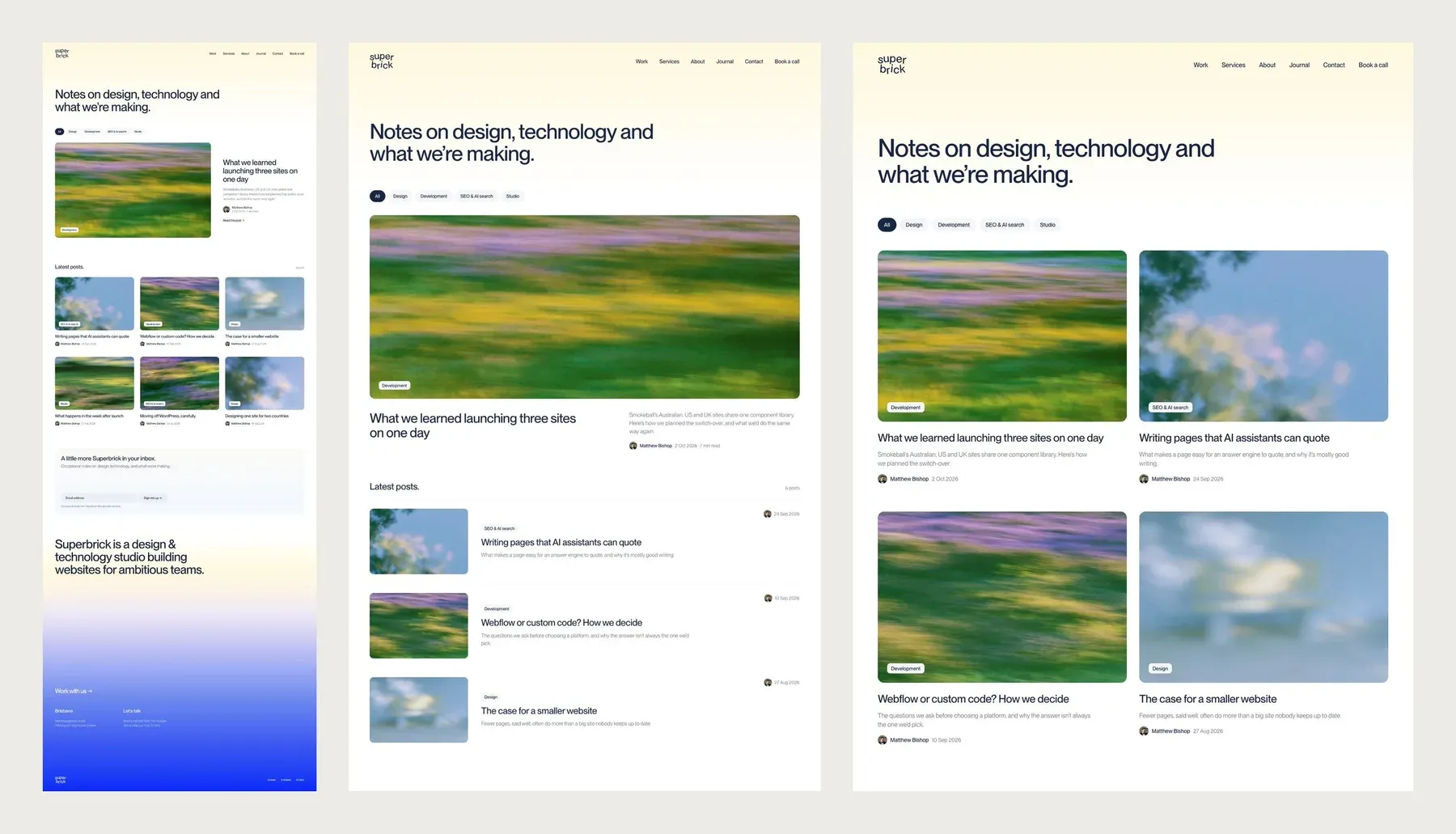
Journal page A, B and C, side by side in Paper. The posts were placeholders at this stage.
Variations work best when you treat them as a conversation:
- Ask for two or three at a time, each with a clear difference, rather than ten near-copies.
- Mix and match. “B’s layout with A’s pieces” is a perfectly good instruction.
- Delete what you don’t want. Removing the versions you rule out tells Claude what you’re keeping.
- Riff on the winner. An earlier direction for our case-study cards went from A to J, then to H2 and H3, before settling on a version Matt had edited himself.
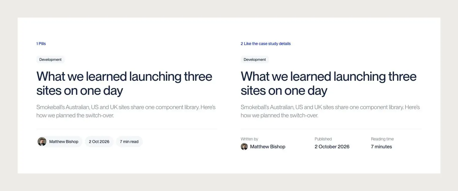
Two byline options, drawn under the same post header so they’re easy to compare. We went with the second.
2. Leave comments where the problem is
Paper has comments for teammates and agents: you pin one to an element, and it can be searched, filtered and resolved (Paper). Claude can list a file’s open comments, see which element each is attached to, make the changes and mark each one resolved. So “made some comments in Paper” is a complete prompt.
Because a comment is pinned to the thing it’s about, it can be short. A few of ours:
- “Can we make this the same width as below, I just want one width for all of the content”
- “can you give it more padding, might mean reducing the size of graphics”
- “Make a completely new agenda layout, do variations”
- “text white”
Comments are threads, so they can carry a conversation as well as an instruction. A client can ask a question on a section, we can reply in the same thread, and the reasoning stays next to the design instead of in an email. When Claude works through a file, it reads each thread in full, replies included, so it acts on where the conversation ended up rather than on the first message.
Clients can comment too. Generate’s team reviewed our design concepts in Paper and left their feedback as comments on the sections themselves, round by round, before choosing the second concept and keeping the two-column blocks from the first.
3. Point at an element instead of describing it
Select an element in Paper and its ID goes into the prompt, so Claude knows exactly what you mean:
- On the journal designs, we selected one topic label and asked “can these be blurred?” Claude tried a frosted-glass version on that label, then applied it to every label that sits on a photo, and left the ones on plain white solid.
- On the author sign-off, “i dont like that this is uneven” was enough. Claude stretched the portrait to match the height of the text beside it, so both edges line up.
- For our mobile menu, we pointed at a bottom-sheet menu in another project’s Paper file and asked for the same idea in our style. Claude read that design, rebuilt it in our file and filled it with our own links.
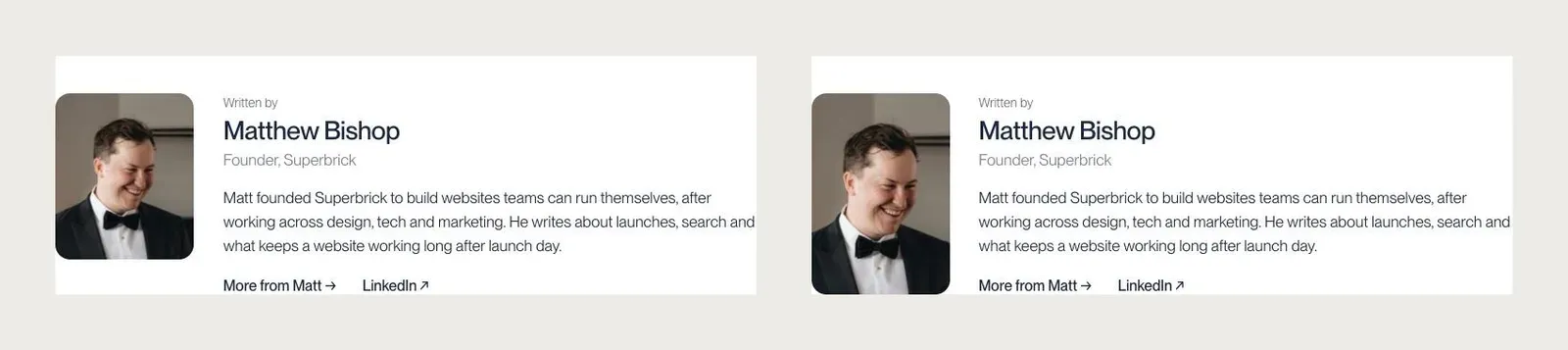
Before and after “i dont like that this is uneven”.
It’s quicker than describing a layout in words, and there’s nothing to misread.
4. Edit it yourself, then hand it back
The canvas isn’t only Claude’s. You can change a design by hand, then ask Claude to finish the job:
“i updated this card but can you make the border radius align to the card correctly”
Because Claude reads the file rather than a screenshot, it works from your edit as it is: the new sizes, the new text and the new spacing. We do this constantly. It’s often faster to nudge something yourself and have Claude tidy it and roll it out to every copy than to explain it.
5. Keep notes for whoever builds it
A static design can’t show everything. Paper boards can hold the rest, next to the designs they describe:
- Developer notes. When we designed message-style reactions for an FAQ, the design sat on its own board with a notes card covering how long to hold before the picker opens, one reaction per visitor, and what to do for visitors with reduced motion turned on.
- Behaviour the mock-up can’t show. On the missing-poster version of our 404, Claude noted how each line would fill in with real data: the address the visitor typed, and the closest real page as a suggestion.
- Site maps. An information architecture board, colour coded by what’s designed, what’s still to design and what’s a template with many pages.
- Tokens. A board of the colours, type and spacing in use, kept in step with the site.
Notes in the file travel with the design, so whoever builds it reads them in the same place as the layout.
6. Design with real content, real states and both screen sizes
Paper’s canvas lays out like a web page, so designs behave like the real thing when content changes. A few things we lean on:
- Real photos and copy. The first journal covers were gradients with one big word on each, and Claude measured each gradient to put the word on its darker half. When we swapped in the photos the site uses now, it dropped the words, because white text wouldn’t read on pale skies.
- Phone versions directly below the desktop ones, reusing the site’s phone header and status bar from earlier designs.
- Real sections, reused. Claude copies the navigation, FAQ and footer from existing artboards rather than redrawing them, so a new page matches the rest of the site.
- Every direction worth trying. Our 404 went through four directions in about 35 minutes: a “missing” poster with tear-off tabs, the same poster held on with tape, a plain version, and the big 404 with a joke FAQ that’s on the site now.
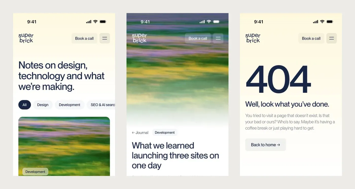
Phone versions of the journal, a post and the 404, designed below their desktop versions.
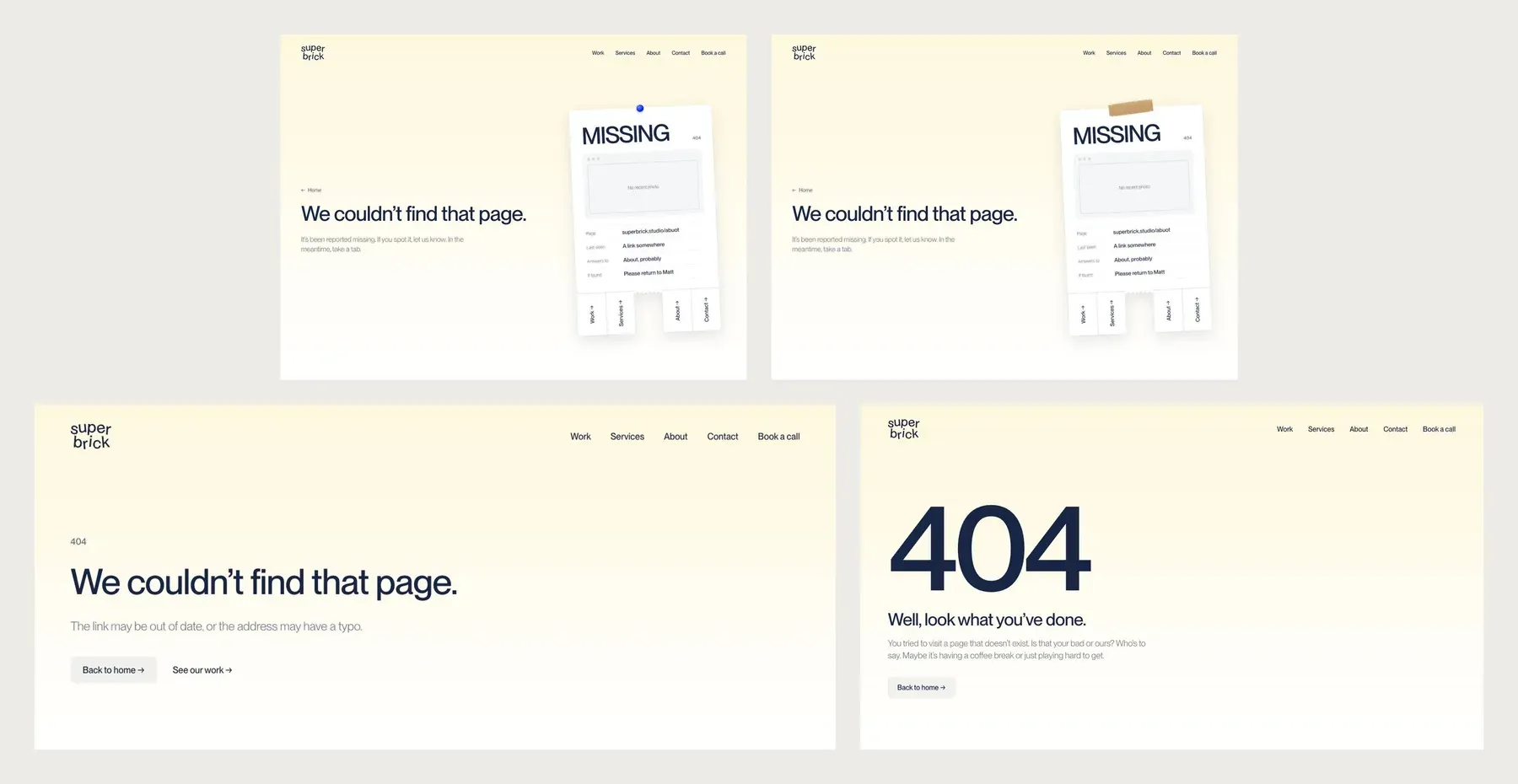
Four directions for our 404, in the order we tried them.
7. Bring in what already exists
A redesign rarely starts from a blank canvas, and Paper has two ways to bring in what’s already there:
- Snapshot. Paper’s Snapshot extension for Chrome copies a live website into Paper as editable layers, not a flat screenshot (Chrome Web Store). Because Paper’s canvas is HTML and CSS, the page comes in close to how it looks in the browser. It’s a quick way to put a client’s current pages on the canvas, mark them up and design the new version beside them.
- Paste from Figma. Select a frame or a whole page in Figma, copy it and paste it into Paper, and it arrives as editable layers (Paper). Components and variables come across as plain layers, and images need Paper’s Figma plugin connected. It suits clients who arrive with designs in Figma.
8. Use it for more than web pages
The same file that holds the website holds the things around it, built from the same tokens:
- Brand assets: our favicon, home-screen icon, share image, LinkedIn cover and profile images were all designed in Paper.
- Proposals: we design client proposals in Paper with the site’s type and colours, and export them as a single PDF (how we build client proposals in Paper).
- Copy as code. Select part of a design and copy it as React with CSS, or as Tailwind, from the export panel or the right-click menu (Paper). It’s handy for handing a single section to a developer, or dropping it into a project that already uses Tailwind.
- Exports: PNG, WebP and AVIF images, video from any frame, and PDFs (Paper).
Paper also does things we haven’t leaned on much yet, such as animated shader effects (Paper Shaders) and image generation on the canvas.
What to know before you start
- Components aren’t out yet. Paper’s build log listed components as coming soon in September 2026, so repeated elements are copies rather than linked instances. Ask Claude to apply a change “to every card” and it will, but it’s worth saying so.
- Claude changes the real file. Paper’s MCP server can read and write, so only connect an agent to a file you’re comfortable with it changing (Paper). Keep explorations on their own board.
- You still make the calls. Claude will build every option you ask for and recommend one, but choosing between them, and knowing when a design is right, is still the designer’s job.
Questions we get asked
Can Claude read comments in Paper?
Yes. Through Paper’s MCP server, Claude can list a file’s comments, see which element each one is pinned to, make the change and mark the comment resolved. Leaving comments on the design and then asking Claude to work through them is one of the fastest ways to give feedback.
Can Paper show several versions of a design?
Yes. Ask for variations and Claude builds each as its own labelled artboard, side by side, so you can compare them, combine parts of two, and delete the rest. We usually ask for two or three per round.
Can clients review designs in Paper?
Yes. Generate’s team reviewed our concepts in Paper and left comments directly on the sections, round by round. Comments are pinned to the element they’re about, so feedback is precise and nothing gets lost in an email thread.
Can you paste Figma designs into Paper?
Yes. Copy a selection in Figma and paste it into Paper, and it arrives as editable layers. Figma components and variables come across as plain layers, and images need Paper’s Figma plugin connected, so check the paste before you build on it.
Is Paper only for website design?
No. We also design brand assets such as favicons, share images and social covers in Paper, and client proposals that export as PDFs. Paper also exports images and video, can copy a selection as React or Tailwind code, and can bring in a live site with Snapshot.
If you’d like a site designed this way, see our website design service, or tell us about your project.