Work

Doctor Canna: a telehealth clinic that looks like healthcare.

Doctor Canna is a nationwide telehealth clinic for natural therapies in Australia. We redesigned its website and rebuilt it in Webflow, around checking eligibility and switching clinics, and have kept it in line with Australia’s health advertising rules since launch.

Client
Doctor Canna
Industry
Telehealth clinic
Country
Australia
Timeline
2025 to now
Work
Live site
doctorcanna.com.au(opens in a new tab)
Our team
  • Matthew BishopProject lead and build
  • Josh BendallDesign
Doctor Canna team
  • Arian VaziriConsultant and copy
  • Andrea Pakis
  • BellaMarketing and Clinic Services

A clinic that looked like everyone else.

Doctor Canna’s old WordPress site looked much like its competitors’, leaning on the same bright greens as most clinics in its field. The brief was for something that felt clinical and professional, so patients would see a healthcare provider first.

Every word and image also had to stay within Australia’s rules on advertising health services: nothing that names a medicine, nothing that promises an outcome, and clear disclaimers throughout.

By the numbers.

  • 2design concepts, then a warmer final direction
  • 3steps from online screening to a doctor
  • 1day to make a compliance change AHPRA asked for

What we did for Doctor Canna.

March to April 2025

Design

Working from a brief and copy by the clinic’s consultant, Arian Vaziri, we presented two design concepts. The clinic chose the cleaner, more clinical one, then asked for it to feel warmer, so the final design brought in a softer green, a serif heading font and rounded edges.

  • Two design concepts, and a warmer final direction
  • Home, How it works, About, FAQs and Contact pages
  • Imagery of people at home and on their phones, not products
  • A dedicated path for patients switching clinics
May to August 2025

Build and launch

We built the site in Webflow, set up in the clinic’s own Webflow account, and connected it to the tools the clinic already used. It went live on 15 August 2025, and we set up Search Console the same day.

  • The clinic’s eligibility questionnaire behind every “Check eligibility” button
  • Booking through the clinic’s existing booking system
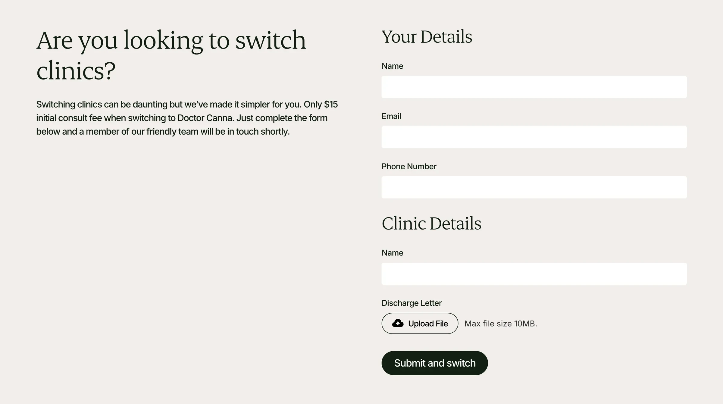
  • A contact form, and a switch-clinics form with a document upload
  • A medical disclaimer in the footer of every page
  • The domain moved across and Search Console set up at launch

October 2025 to now

Keeping it current

Since launch we’ve kept the site in step with the clinic’s compliance needs, from updated terms to a change AHPRA asked for, made within a day.

  • Updated terms and conditions
  • Offer terms shown alongside the switching offer
  • The LegitScript certification seal in the footer
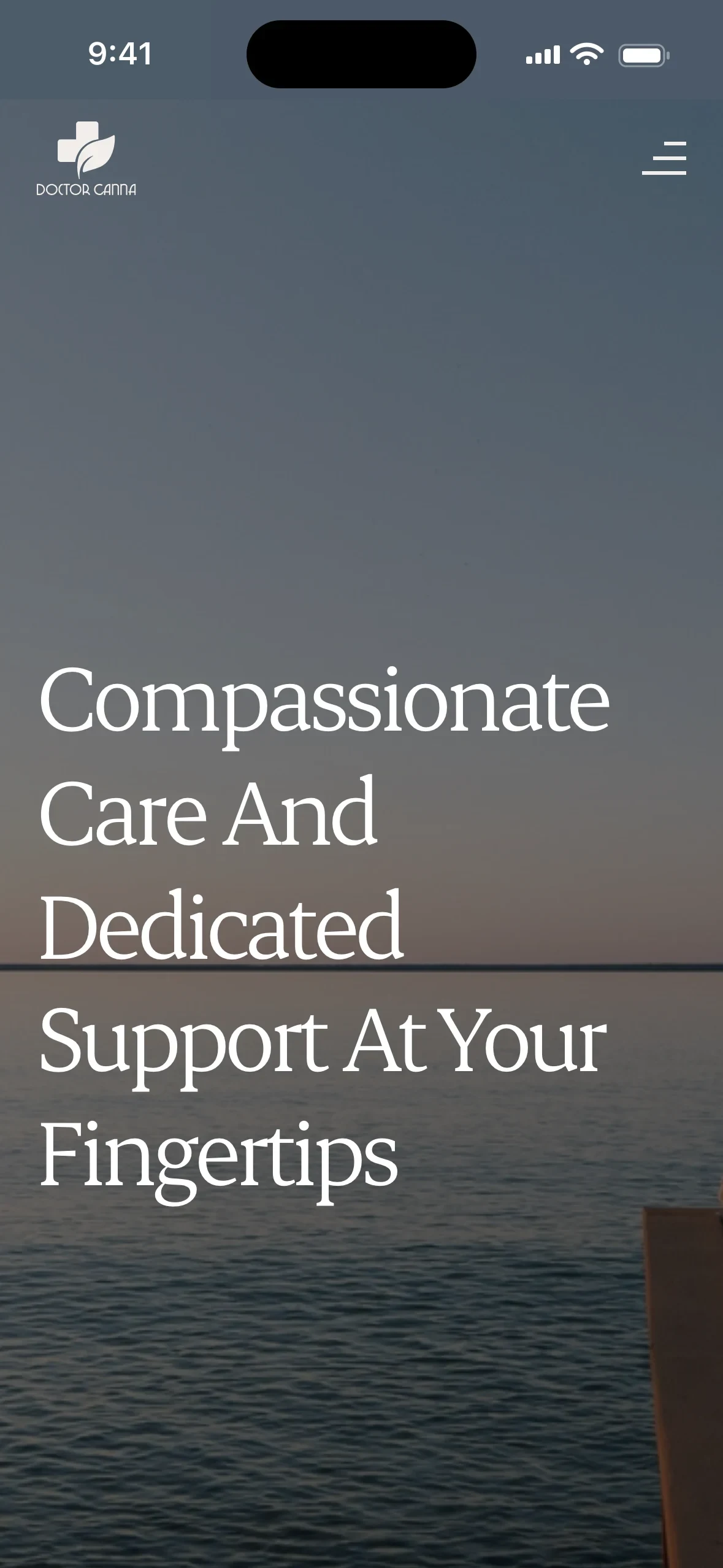
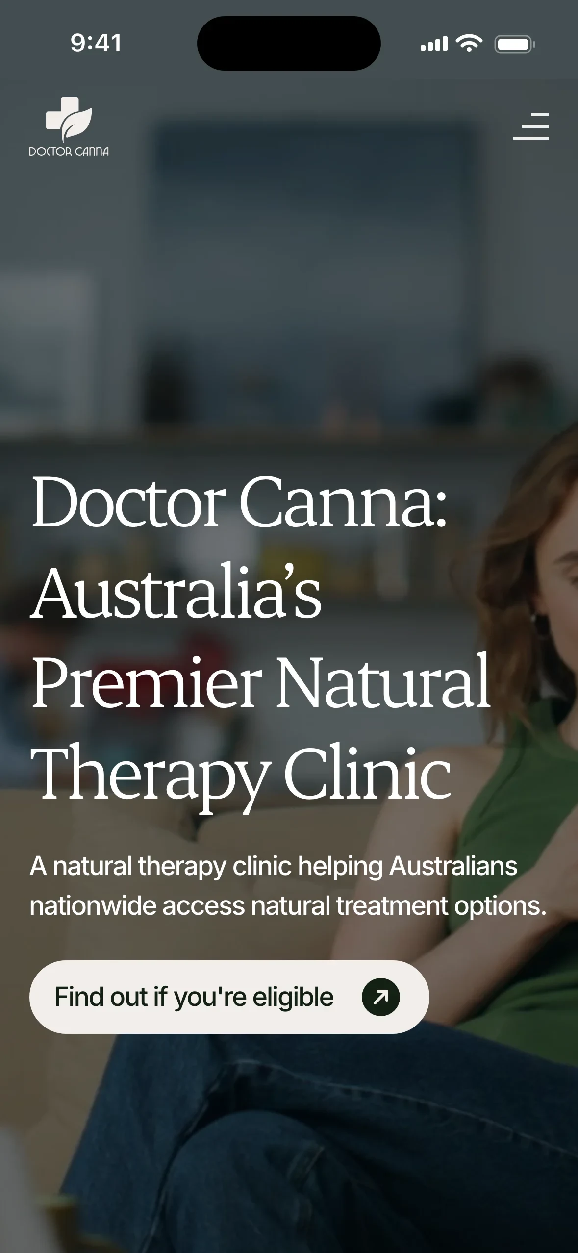
  • The Doctor Canna home page on a phone
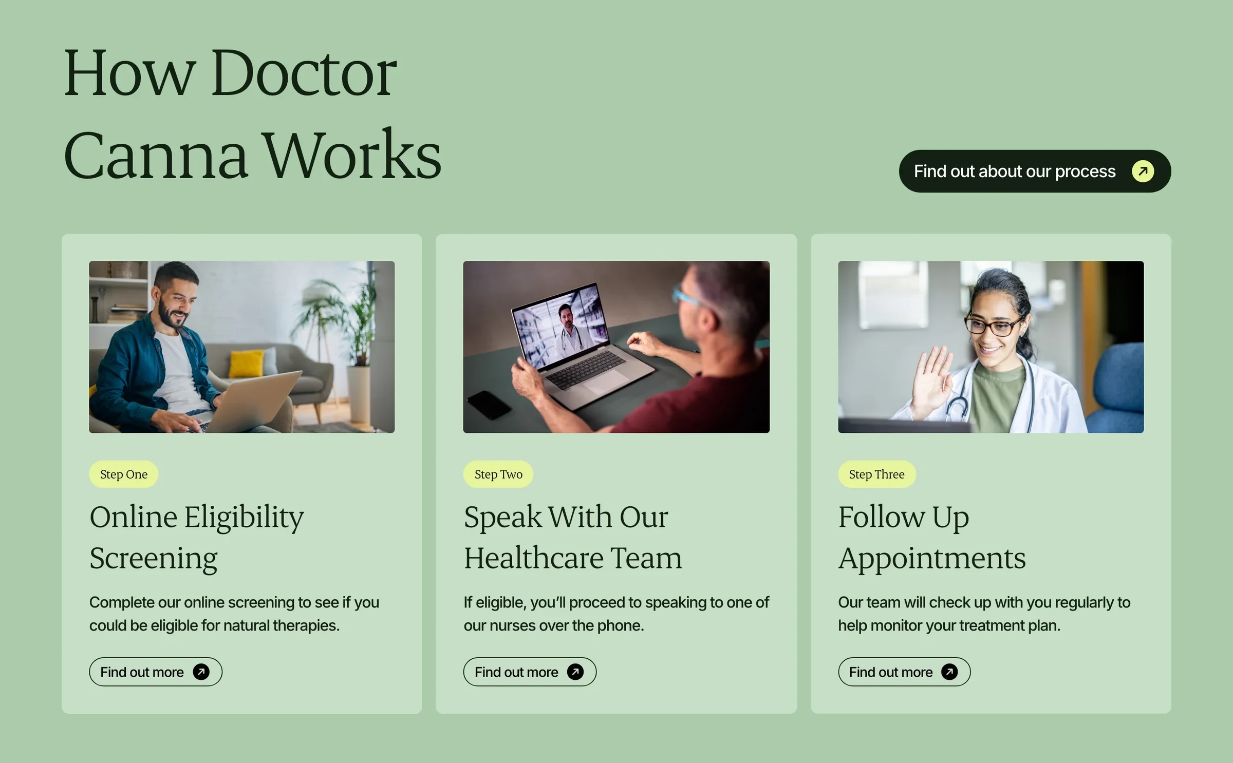
  • How Doctor Canna works, on a phone
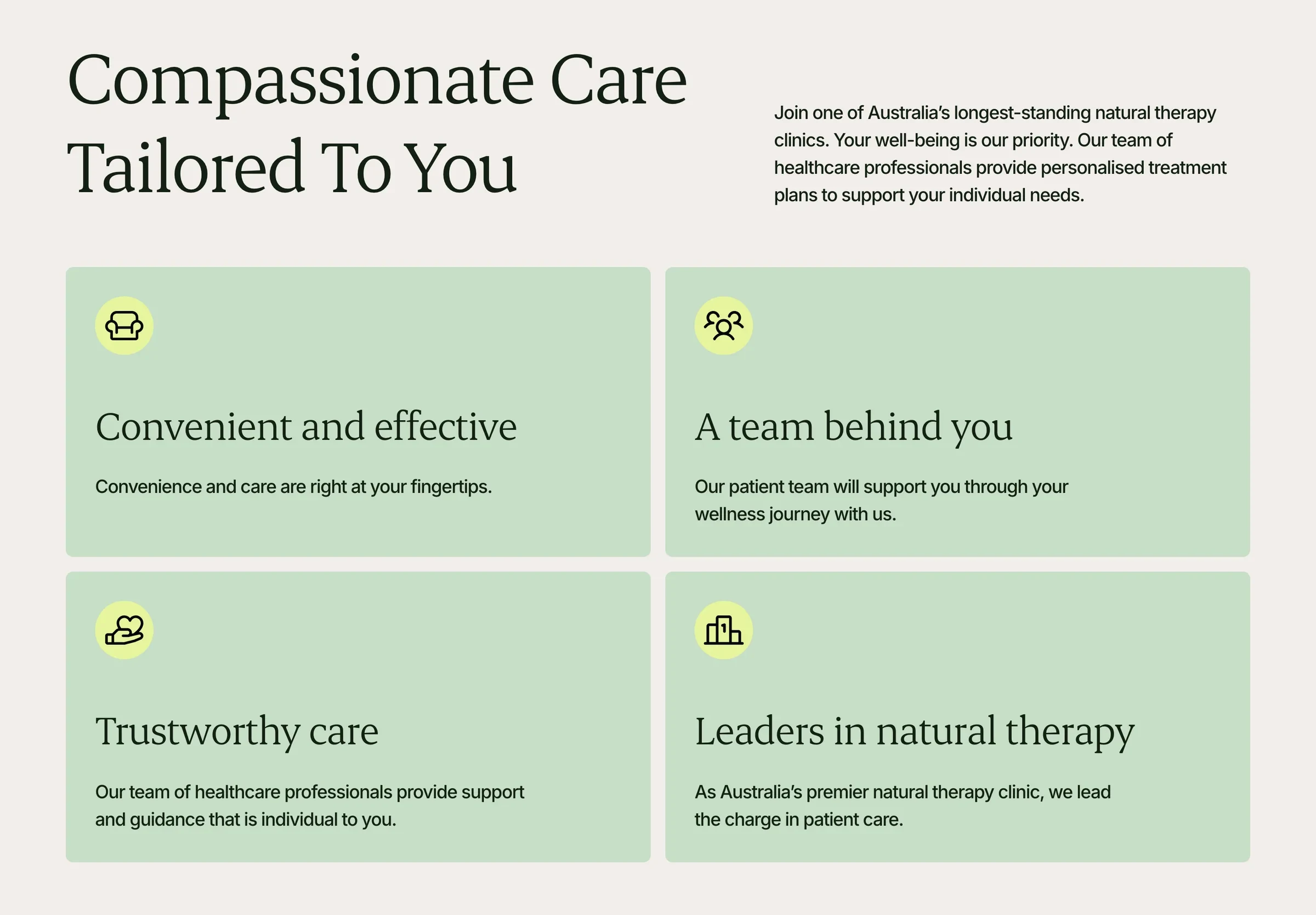
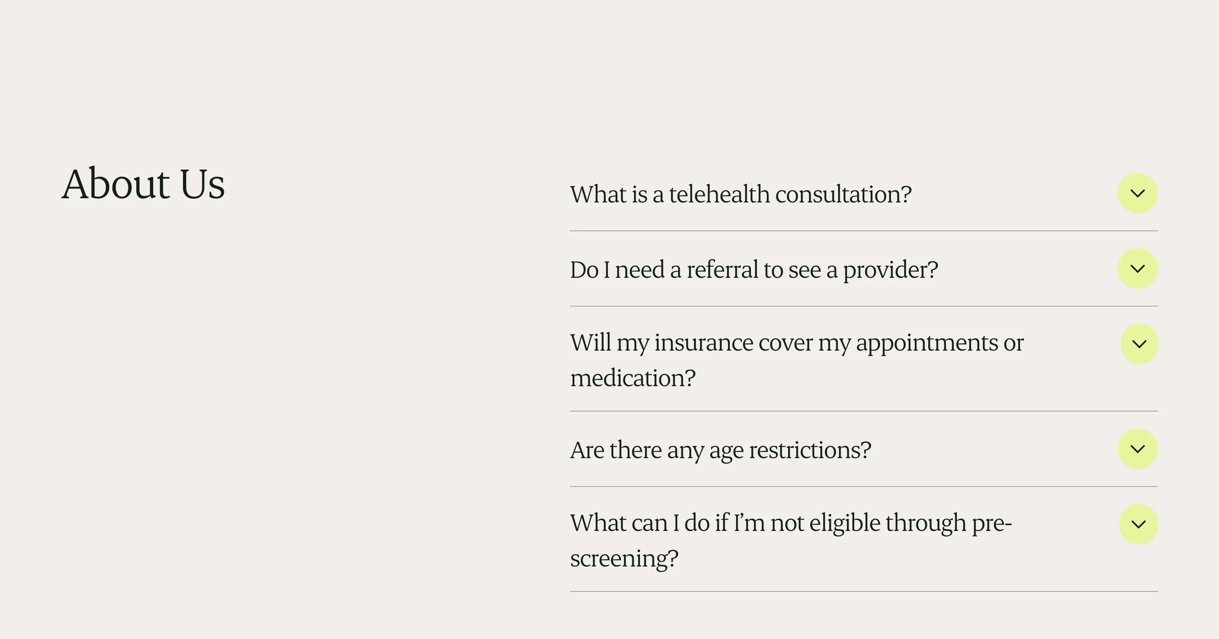
  • The Doctor Canna About page on a phone

Out of the sea of green.

Most clinics in this space look alike, with the same bright greens and the same kind of imagery. We took Doctor Canna somewhere calmer: a soft sage, a warm off-white, an elegant serif for headings, and photography of everyday people at home, on the phone or outdoors.

The first concepts were clean and clinical. When the clinic asked for something more nurturing, we warmed the palette and softened the corners, so the site now reads as a caring healthcare provider rather than a product.

Eligibility comes first.

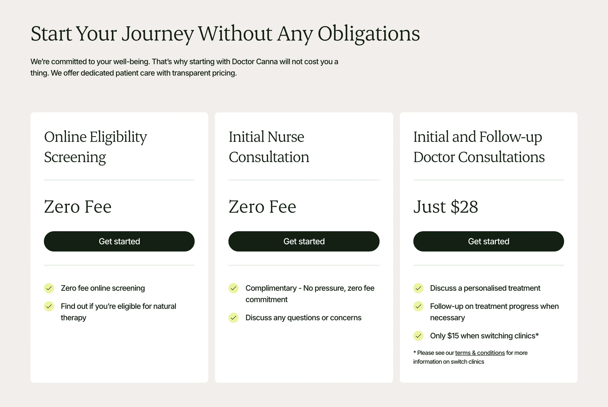
Not everyone will be suitable, and the site says so up front. Every main button leads to the clinic’s online eligibility questionnaire, and the how it works page lays out the three steps: a free online screening, a free call with a nurse, and then a consultation with a doctor.

Prices are shown for each step, so patients know where they stand before they begin.

A path for patients switching clinics.

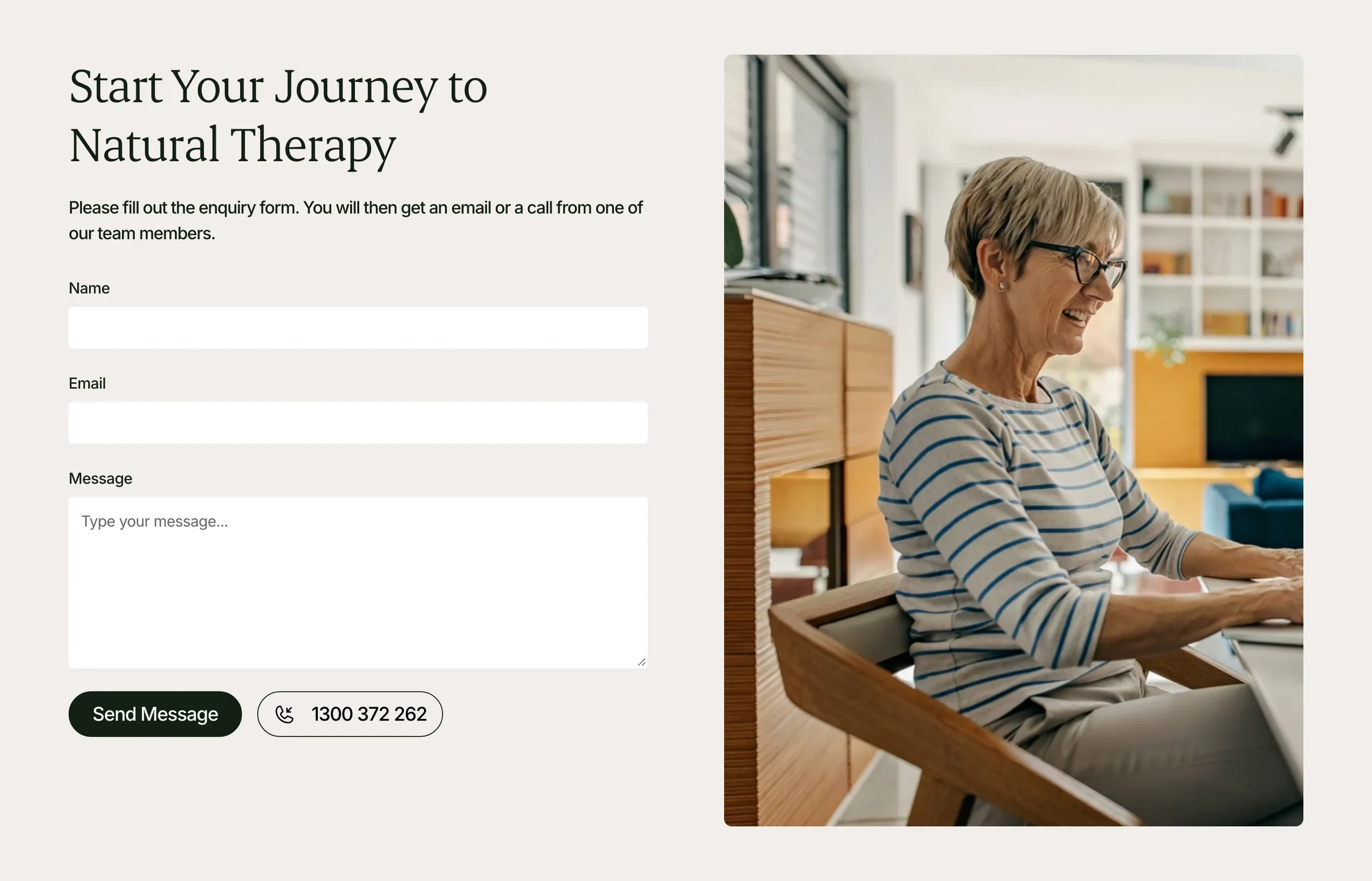
Many of Doctor Canna’s patients come from other clinics, so switching has its own place in the navigation and its own form. Patients enter their details and their current clinic, and upload their discharge letter, so the team has what it needs before the first call.

A general enquiry form sits alongside it, and the clinic’s phone number is one tap away on every page.

Within the rules, on every page.

Health services in Australia can’t advertise the way other businesses do. The site talks about natural therapy and personalised care, names no medicines and makes no promises about outcomes, and every page carries a medical disclaimer explaining how medicines are regulated in Australia.

When AHPRA asked the clinic to show the terms of its switching offer next to the offer itself, we had a proposal back within half an hour and the change live the next day. In December we added the clinic’s LegitScript certification seal to the footer.

Built around the clinic’s own tools.

The clinic already ran its eligibility questionnaire and its bookings in other tools, so the new site works with them rather than replacing them. The questionnaire opens from the site, and bookings go through the clinic’s existing system, so nothing changed for the team behind the scenes.

The site sits in the clinic’s own Webflow account, with us as a guest, so they own it outright.